All_ebt
In 2018, going to the supermarket and using an Electronic Benefit (EBT) card, also known as food stamps, can be an uncomfortable experience due to the stigma attached to it. To make matters worse, this welfare benefit cannot be used everywhere because not all food services permit this kind of payment. But what if we changed that? I was part of an ambitious startup whose mission was to redesign the experience of an EBT card holder by turning it into a smart wallet.
To comply with my non-disclosure agreement, I have omitted confidential information in this case study. All information in this case study is my own and does not necessarily reflect the views of All_ebt.
Context.
There has always been a stigma towards people who use food stamps. One in seven Americans receive food stamps. That’s about 46.5 million Americans. The use of Supplemental Nutrition Assistance Program (SNAP) has skyrocketed in the past years (38.8% in the last five years, according to the Food Research and Action Center). Hunger is a very real problem that Americans are facing. One of the biggest misconceptions about food stamps is that people who use them are lazy and abuse the system. Most people who are eligible for the benefits do not want to be thought of as a person who cons the system to the point where they feel uncomfortable going into a store and using their EBT card.
While working as the Lead Creative Designer at the startup accelerator based in Puerto Rico, Parallel18, I was approached by one of the startups who was interested in creating a solution to this issue and the stigma that comes with it. The startup, All_ebt, breaks this stigma by turning the physical EBT card into a digital one. Basically a smart wallet for the EBT. I was curious about the project, but even more so because of the fact that they hadn’t built much, so it was a chance to create from scratch.
Where to? North
Building something for a potential 46.5 million client base is not an easy feat. However, from the get go we were sure we didn’t want it to be something that felt outdated or harsh.
Our high-level goals were to:
1. Make it fast and simple to use
2. Be appealing to a universal pool of potential users.
3. Make it clean and appealing
My role.
I led the design experience between August 2018 and November 2018. As the sole designer, I designed every aspect of the user’s experience and user interface for this project.
In addition I worked with fellow team members in order to create content, visual guidelines, and iterations based off of the data synthesis found in the lo-fi prototype phase. The app is currently in development. September 20th, 2018.
Mid-fi All_ebt prototype. Late September, 2018.
Constrains
Having such a huge client base and almost no budget to develop the app, user personas were built on a very small population of interviews. Although it has been proven that a small population, with the correct leading discussion, can produce an efficient UX base model that future users can/will use.
This being an accelerator program, at times the deadlines felt rushed, and we couldn't explore deeper. In these instances we would tell ourselves, “Done is better than perfect.”
The process.
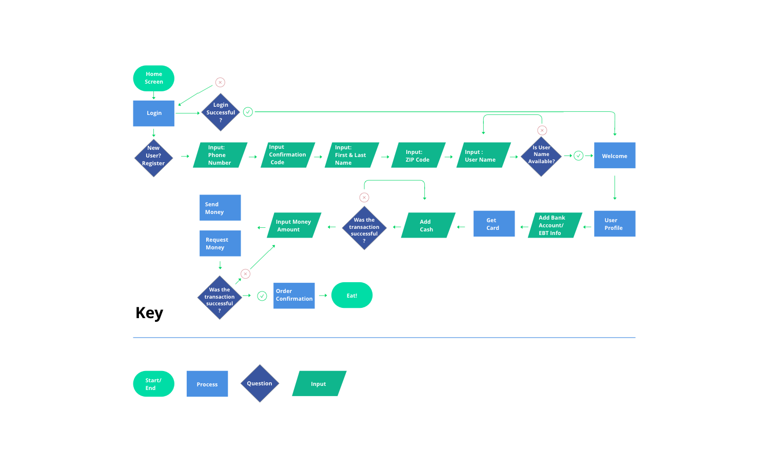
After a debriefing of the personas built for the project, my role was a bit more defined. We proceeded to draw initial sketches and determine user flow.

Prototypes
A lo-fi prototype (paper model) was built and tested on a pool of users in order to validate the design choices and user flow before proceeding to a more complex line of design (which would take a bit more of time to develop considering I was the sole designer in the project).
Low-fidelity prototype. Early September, 2018.
What we found.
Users were uncomfortable with having to create a user login, share their email, phone number, and then receive a text message to confirm their login.
User Testing
4 out of 10 users were a bit confused with the experience and 2 out of those 4 suggested having a facebook login button to streamline the process.
5 out of 10 users expressed interest in wanting to refer the application to other people due to the convenience it offered. 1 out of those 5 asked if we could implement a referral system/cash reward for said referral.
Designing the UI.
We implemented the changes that the users asked for and began building a more stylized version of the product based off of some of the CEO’s visual preferences.
This was a tough negotiation process due to the seriousness of the app and his desire to make it more “hip.” A compromise was made in order to appease both sides. A clean, modern feel was built around a banking app model.
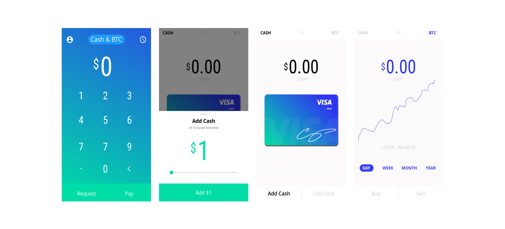
Keeping the “young colors” he wished to implement, while having a professional atmosphere to it, we also implemented a bitcoin feature that allowed you to monitor the BTC market. This would let users buy bitcoin with the portion of the EBT that could be used for any purpose, if they wished.
App Mockup. Late September, 2018.

Reflections.
Being the only designer can be a very fun experience, especially for a project that plans on tackling such a big market. The opportunity was exciting to say the least.
However, deadlines can become stressful when there is so much work to be done by one designer. Meeting deadlines, in order to keep stakeholders and development on schedule, takes a toll on a person.
Recommendation for next project: Have realistic expectations of goals with team members. A lack of communication can strain the design process. Potentially working with a second ux/ui designer in order to bounce off ideas, divide tasks, and have a second opinion/voice backing up the work that has been done can be key.


