
Jasper Health
Jasper Health provides the high-touch guidance that people living with cancer deserve through one-on-one navigation, personalized information, and smart planning. Jasper Health doesn’t stop there – we act as the central connector – bringing together oncologists, care management teams, specialty pharmacists, caregivers, and more, to deliver whole-person care.
The mission is to provide people affected by cancer with personalized digital and human-led support to improve quality of life and outcomes.
Context.
From birth to death, people born in the United States have a 41% of developing invasive cancer. We all have a family member who unfortunately has gone through cancer. In my case, my mother-in-law. As I matured into my mid 30s, I questioned my impact in the world and if I could use my skillset to help people going through a life changing event. How could I help people with cancer with design?

My Role.
I began my journey at Jasper as a Senior Designer and eventually transitioned into the role of Director of Design for the Consumer platform. In this position, I was responsible for defining design guidelines, standardizing design patterns, and establishing a robust design system. I conducted user research sessions to enhance the product, led product rebranding efforts, and managed tasks for the design team. Additionally, I proposed new features based on competitive analysis and user research, continually striving to improve the overall user experience.

Research Tools.
To conduct user research, we utilized various tools such as internal surveys and questionnaires. However, our primary method was User Interviews. Due to HIPAA regulations, only our clinical team could directly engage with members. We interviewed cancer patients who met our established criteria through User Interviews. Some of these participants even chose to convert to Jasper Health after the sessions.
The Sample.
We conducted an in-app survey for around 1,000 participants, asking users a series of questions about their experience. To supplement the quantitative data, we selected 30 participants from User Interviews for in-depth interviews via Zoom over the course of a year.

Pain Points.
Our initial user research identified three major pain points: an over-cluttered app with too many secondary features, unclear messaging about user focus, and a lack of web support. Users often asked, "What is the main function? Tracking steps? What are you selling, and for how much? Can I do this on my computer?" We found that the 65+ age group we cater to prefers using desktops for better visibility and ease of use.
What Are People Saying?
I like having someone to walk me off the ledge. When I took all of my medication and did all of the exercises, talking to someone helped me calm down. Cancer is 80% mental.”
— Arthur S, 62
“I don’t know what you want me to do. I get to the home screen and don’t understand what I’m supposed to do. How does it work? Where are the buttons?”
— Emily H, 66
“I’m confused. I’m sorry. I just don’t understand what I’m supposed to do. Is there someone I can talk to? I just prefer using the phone.”
— Michael R, 71
“It’s so small on my phone. Can I see this on my computer? I mostly use my laptop. My eyes aren’t what they used to be.”
— Glenda A, 60
“My doctor gives me medicine and treatment, my family try to support and I have to put my best face with them but I didn’t know I needed someone I could be scared with.”
— Molly D, 58
“What is a Care Coach? Like a life coach? I don’t need a life coach. I can’t stop thinking about my bills and who is gonna take care of my kids. I need help managing my anxiety””
— Francis P. 65
Key Findings.

Simplify offering
We quickly realized that our aging members undergoing cancer treatment needed a more straightforward, linear experience, rather than the "choose your own adventure" style our product originally offered. They required a simpler interface that directed them clearly to the product's key features..
Clearer Messaging.
When we asked members to describe the product in their own words, many showed significant confusion. This revealed that they didn't clearly understand the main function of the product. We realized that better definitions and clearer messaging were needed to help members grasp the product's purpose and determine if it was something they would be interested in.

System Supports
The organization’s initial investment into a mobile experience was met with the member’s immediate need for web support. To provide a seamless experience, it became clear that we needed to build systems that catered to both mobile and web platforms.
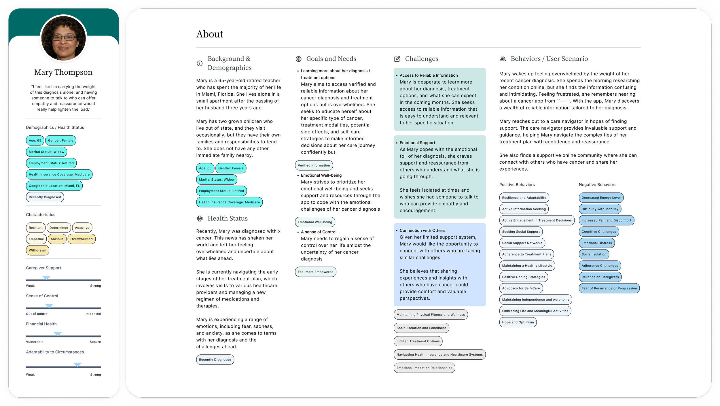
User Persona.
Each cancer patient's journey is uniquely their own, making it challenging to create personas that capture all possible variations. However, we managed to develop building blocks to group patients into cohorts based on common goals, needs, challenges, behaviors, and other key identifiers. These cohorts helped us construct user personas that more accurately represent the diverse experiences of our users..

Hypothesis
Following our research and persona development, we arrived at the following hypothesis: Simplifying the experience by removing unnecessary secondary features will increase engagement with the hero feature. Providing a clear message about the product's functionality and estimated cost will reduce initial questions from members. Additionally, establishing a robust design system compatible with both web and mobile platforms is crucial for sustaining support across both channels.
Initial Sketches.
ypically, I aim to express ideas with minimal effort. This often involves sketching them out on a blank sheet of paper, allowing me to visualize my thought process initially. This approach helps me concentrate on the right initiatives and visualizations needed to effectively communicate an idea.

Initial Sketches

Finalized File Standardization Flow

Team Discussion around feature prioritization communicated through feature mapping.
From Lo-Fi to Hi-Fi.
Occasionally, time constraints may necessitate going straight from sketch to high-fidelity design. However, when time allows for it, starting with low-fidelity designs can be a valuable visualization tool. It facilitates discussions without diving into the final iteration prematurely.

Lofi allows us to see the flow for other values like ‘length’ , interactions or placement. Although branding plays a pivotal role in a product, establishing a proper infrastructure will allow for easier updates down the road.

Once the ‘bones’ are established and everyone on the team is aligned, we can add the aesthetics into the mix. When thinking of product design I understand the importance of branding as it is the first impression the member gets of the product. When done right, branding that carries over into the product’s UI, members experience product-brand synergy. That being said, it is never a 50 (Form) /50 (Function) split. At times, function will dictate form. It is our job as product designers to adapt and meet engineering in the middle in order to build a deliverable product.
Version Iteration Breakdown & Design System.
Working at a startup offers the beauty of rapid iteration. The well-known mantra "fail fast, fail forward" encapsulates the adaptability necessary to thrive in such an environment. Recognizing that no solution is flawless, being able to pivot based on member feedback is the most actionable step any company can take to validate its offerings. Being able to draw a map showcasing the changes done / needed is key for any design team to succeed / understand what is needed.
Version Iteration

1. Refocus the attention on Actionable features .
2. Give prime real-estate to features that users are using.
Design Systems


3. Iterate upon the features members show interest in.


Documenting work is the biggest tedious advantage a team can work towards. Being able to share with engineers and other designers style guides, component libraries, change logs and color mapping is a real time saver. Updating libraries can save time across the board as global changes can cascade down into multiple workstreams.

The Results.
A mentor once shared with me a valuable analogy: "To have wood for winter, you have to take out one tree at a time." This saying serves as a reminder to focus on completing one task before moving on to the next, helping me stay grounded amid the fast-paced startup environment. By concentrating on building a robust system while simplifying our feature focus, we were able to prioritize speed without compromising on the member experience.

Positive Reception.
Members expresed positively to the app changes. Being able to find the things that mattered to them faster made them engage more with the product overall.

Member Adoption
Being a accommodating product as long as it satisfies members needs showed higher adoption to certain services. Giving member things like loginless sessions and phone sessions has enabled member participation.

Less Hand-Holding.
Simplifying the member experience drove to a higher satisfaction rate and lessened the amount of customer service support required to onboard a member.

“Before Jasper care navigation, I was overwhelmed with the diagnosis. Through conversations with my navigator, the relevant cancer organization partner websites, and guides, the information my navigator provided puts me at ease”
— Lindsey S., 61
Some Lessons
Trusting my gut was a muscle I definetely developed through some of the product definition process. Keeping the user as the main stakeholder of focus will always prove beneficial into the product insight and future definition. The user always tells a product what they struggle with and what they need help with, we just have to listen.

Empathy is a super power.
Ultimately, we're all human, and the desire to be heard is universal. Certain user populations find themselves in more delicate situations, necessitating a heightened level of empathy. The ability to connect with our members lies at the heart of why users choose to engage with us. It's this genuine care and connection that truly makes a difference.

Don’t throw spaghetti at the wall.
Bombarding users with a multitude of features in hopes that one will resonate often results in a lack of focus during iteration. How can we pinpoint what needs fixing when we've inundated the member with too many options? Through user research, we were able to reassess the significance and positioning of certain features, guiding members toward areas of higher interest.

Reflections.
Moving towards what the user wants usually proves beneficial to the organization. Finding that sweet spot between stakeholder and member needs is the balance we play in product organizations. Understanding that without a member centric experience, the member interest might dwindle but that there is always room to pivot and iterate upon user research findings.